Mobile Media
 Media companies are now focusing heavily on mobile content distribution and looking for new revenue models on mobile devices. Understanding the unique opportunities and constraints of this medium isn’t exactly intuitive. The device landscape and trends seem to change bimonthly and there isn’t a ‘no-brainer’ template for companies to adopt and invest in. Everyone just has to jump in the water and start swimming or be left behind. New business models, design patterns and user interactions are all still being sorted out in this evolutionary process.
What makes mobile application usability different from the traditional website equivalent? In short: small screen, limited input devices, and infinite variability of social and environmental contexts  encountered by mobile users. You can’t regurgitate your website onto a small screen and call it a day, you have to give some thought to the wants and needs of a user are as they pull their mobile device out of their pocket and open your app to interact with your brand. You have to evaluate what makes your brand special in the mobile context and play to those strengths with a polished and easy-to-use application. “Usability” has lately catapulted into a long-deserved limelight role in product creation. The promotion of usability has created a new vocabulary for customers to differentiate “good” software and it can no longer be a secondary consideration.
So what attributes make a news media company’s application truly excellent and usable?
Learn by watching
I began surveying and analyzing newsreader apps from top-tier publishers and selecting the ones I thought were important and thoughtfully designed. I followed this with some solo deconstruction of what I thought was good and what was bad. Obvious factors like response time, presence or lack of features, general aesthetics all jumped out but these are hard things to quantify outside of whatever heuristic yardstick I might personally apply. I’m a web systems designer, therefore I am an atypical web user. To properly analyze which features of these newsreaders were successful I needed real potential users in real usability tests.
For my usability testing project I teamed up with Fernando Mondragon, a PhD candidate from UT’s construction management program who specializes in Worksite IT/Communication problems. Fernando’s non-media background in usability was a complement to my over-familiarity with the products and goals of these applications. This variety of experience greatly improved everything from the design and conduct of our tests to the overall level of analysis and validity of our conclusions.
 Ideally, Fernando and I would have 150 perfectly random people test every available newsreader app with a swarm of IR cameras, eye-movement sensors, heartbeat monitors and lie detectors. In the real world, the design of our usability test was limited by some constraints. Time and resources were not unlimited so these factors dictated the breadth and depth of our testing. 4 apps x 4 test subjects was our reasonable starting point. This test is unusual due to the small number of participants and the very broad set of application functionality we are reviewing.
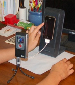
Usability testing on mobile devices does not have a strong vendor backing. There is no existing screen capture video software for the iPhone. Our testing equipment consisted of a Flip video camera with tripod pointed at a computer speaker. An iPhone was fastened to the speaker with double-sided tape normally used for automotive trim. Unfortunately, this setup strongly limited use of the panoramic display modes of the phone in our testing and the video camera did a poor job of focusing on the user’s screen activity.
The candidate apps we selected for testing were: New York Times, CNN, USAToday and the original ACBJ Application for the Austin Business Journal. We didn’t know exactly what we were looking for – our early vague description for the testing goal was to find “Things that work and things that don’t” and that drove our test design. Our requirements for designing the test were also unusual due to the number of apps being tested. Most usability testing focuses on measuring and commenting on a single app or possible divergent versions of the same app. We had to do our best to build a testing script that was generic enough to return some comparable metrics across 4 very different applications. We also encouraged test subjects to ‘think aloud’ during testing. User comments from these sessions were invaluable narrative to decode their interactions. Here is our actual final testing script:
1. Open the application
2. Find [SPECIFIC HEADLINE OF NEWS STORY]
3. Read the entire Story. Verbally acknowledge when you are finished.
4. If possible, select the photo for detailed viewing. Interact with the photo in whatever ways are permitted (enlarge, pan, zoom, etc.)
5. Find and explore available options for sharing the article you are reading with a friend or social network. Examine the details of available options but settle on emailing the article to [EMAIL]. Navigate back to the article you were just reading.
6. Find and read the article with the headline [SPECIFIC HEADLINE] using whatever search or navigation is available.
7. Navigate back to the default, opening page of the app
8. Freely explore the app, observing and commenting on the design, organization, categorization or hierarchy of the content. Verbally acknowledge when you are finished.
9. Done. Please answer post-test questionnaire.
We took turns administering the test. We video taped and subsequently timed task completion and noted error rates. We had low hopes of getting precisely quantifiable data that would be valid across apps. My only initial expectations of quantitative data points were to support our observations of obvious failures and successes in the app designs and that ended up being the extent of this data’s usefulness.
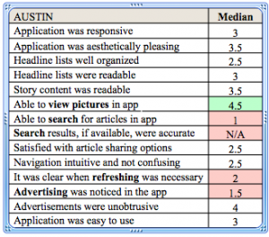
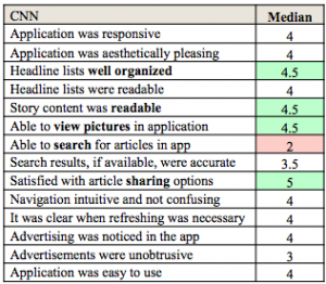
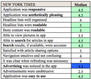
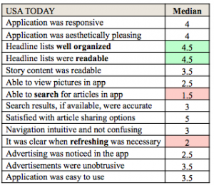
A post-test questionnaire was completed by the participant for every app tested. This was equally generic and asked users subjective questions about the apps using a 1-5 scale ranging from “Strongly Disagree” to “Strongly Agree”.
1. This application was responsive
2. This application was aesthetically pleasing
3. The headline lists were well organized
4. The headline lists were readable
5. The story content was readable
6. I was able to view pictures in this app
7. I was able to search for articles using this tool
8. The search results, if available seemed to be accurate
9. I was satisfied with the options for sharing these articles with friends
10. The navigation was both intuitive and not confusing
11. It was clear when I had to refresh the headline list to get latest news
12. I noticed advertising in this application
13. Advertisements in this application were unobtrusive
14. Overall, I found this application easy to use
Finally, once all apps were tested we had an open discussion with the test subject about all of the apps.
1. Which app was the easiest to use? Why?
2. Which app was the most frustrating? Why?
3. Which was most aesthetically pleasing? Why?
4. Which had the best options for sharing? Why?
5. Which was the most responsive?
6. Would you pay for any of these apps?
7. What would you change about these applications to make them easier to use?
8. Any other observations from the user? Additional questions from the moderator?
Our four test subjects were all familiar with the iPhone/iPod touch interface but none were iPhone owners. To boost familiarity we gave our participants a brief overview of the iphone interface and pointed out standard interface icons like “back” and “share”. Our test participants were 3 females and 1 male, ages 18, 21, 33, 37. These people were selected because they were convenient test subjects willing to take the time to help us. We were concerned at the outset that this selection criteria was not sufficient but in the end we’re not sure that it had a large impact on our findings.
During testing, we never indicated whether these apps cost money or were free.
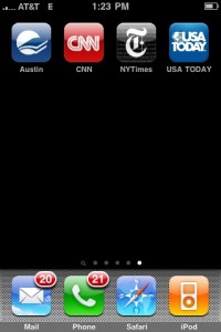
Each testing session tested the apps back to back an an iPhone 3G. The order of the applications tested was randomized for each participant. The starting screen for the users was an iPhone desktop with only the icons for these 4 apps displayed. The phone was using the AT&T 3G Network in Austin, Texas with full signal.
Test Results
Austin Business Journal
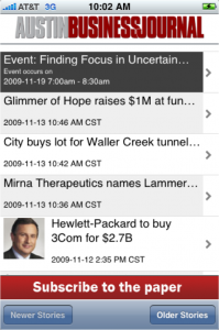
Whether or not to test the ABJ app was debated up front. I spec’d this application and oversaw its construction. It is a barebones example of what these applications can be that was produced on a prototyping budget in a limited timeframe. We knew it was not going to shine in these tests – the production quality and functionality were not really in the same league as the premium apps we were pitting it against. In the end it was good to verify what we already knew about the app and more valuable data was gathered. Users were not enthusiastic about the app but they also said it was a straightforward way to read recent headlines. The worst usability issue was the “Email to a friend” function which forces the user into the iphone’s native email application without warning, forcing the user to find and open the ABJ app again. The limited navigation was also a major downside of the app although users commented favorably on the availability of lots of older articles.
 |
 |
The Good:
- Simplicity
- Zoom-able text
- More historical content available
The Bad:
- Simplicity
- Limited Navigation
- Confusing Sharing Behavior
- Small Font
- Poor use of advertising
- No Search function
- Thin content, almost no images!
CNN News
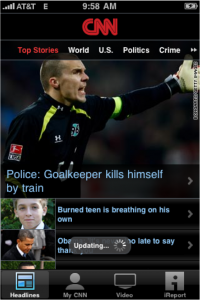
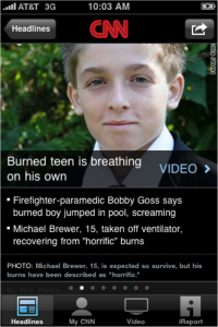
This was the only paid app we tested. Downloading CNN’s app costs $1.99. There was a well-coordinated launch of this app with lots of cross-promotion on CNN’s website and cable news channel and the app is generally considered to be a success story in the mobile app space. Our users had some issues with readability and navigation – particularly the topical subnav used in the top section of the application. The iReporter functionality was probably the most distinguishing secondary feature of any of the apps and all of our users commented positively about it. Users were also impressed by the perceived amount of available content and the novel navigation between sequential news stories. White-on-black font garnered some negative comments and advertising was thought to be overly obtrusive in some areas, particularly video content. Users really liked the wealth of options for sharing content across social networks and the app implemented sharing seamlessly.
 |
 |
The Good:
- Bullet Points
- Unique article nav
- Sharing
- Lots of content
- iReport function
- Polished, ambitious app
The Bad:
- Text contrast
- Top nav difficulties
- Obtrusive advertising
- Small font, not resizable
- Broken Links in story test
- Lack of Search function
- Video controls
New York Times
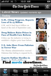
The New York Times app is clearly the product of a lot of research and thoughtful development. Users repeatedly commented on how well it conveyed the New York Times’ brand and dignity. It was unanimously cited as the favorite app by all of our testers. The inclusion of search and attention to readability in the content viewing screen seemed to be the biggest differentiators. The multiple options for resizing text and viewing area, font selection and spacing, subtle interaction with screen controls and general aesthetics combined to give a quality small-screen viewing experience for reading NYTimes’ lengthy articles. To some extent this preference may have been influenced by the structured tasks we gave the users, framing the criteria they used to evaluate the app. In at least one case a user acknowledged their strong bias towards the content of the New York Times as a publication as an influencing factor. While NYTimes gets points for including some kind of search, 2 of the users had trouble with the default search interface’s lack of design cues (see video). Users mentioned somewhat obtrusive advertising, some accidentally clicking on them while attempting to scroll.
 |
 |
The Good:
- High readability
- Search!
- Sharing
- Lots of categories
- Aesthetics
- Unanimous user favorite
The Bad:
- Some obtrusive advertising
- Default search interface is confusing
- Lots of scrolling
USA Today
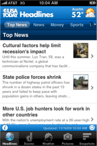
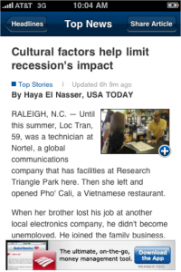
Content options and organization were well-liked in the USA Today application, however, this app also had severe issues with tricky-to-manipulate topical sub-navigation. Readability suffered from small fonts and lack of options for zooming. Sharing options were great but, like the ABJ app, emailing articles to friends caused the user to leave the app with no explanation. This was discordant with the level of polish seen throughout the rest of this application. Additional content was deep and featured lots of photos, which our users liked. One user remarked that he had a low opinion of USAToday content and that may have influenced his evaluation.
 |
 |
The Good:
- Good categorization
- Pleasing design
- Lots of additional pics and content
- Intuitive to enlarge photos
- Sharing options
The Bad:
- Top Nav difficulties
- Bad sharing behavior
- No search
- Small Font
- No text zoom
- Poorly presented use of LBS
Conclusions
This was a pilot study. We had a limited number of applications to test and a limited number of people testing them. That being said, this study was perfect for uncovering the “Wow” moments and “Whoops” factors in these 4 designs and also in the design of our testing procedure itself. We not only reaffirmed things we already knew from our own heuristic evaluations, we earned some new insights and saw firsthand the level of impact the most subtle usability considerations have on users’ perceptions of the apps. It’s amazing how much information can be derived from small studies.
Advertising Observations
Usability of the advertisements themselves should be of primary importance.
1. Load Ads Instantly. Frequently when our users clicked on an advertisement the response time was abysmal. Users showed highest frustration when advertisements took over the application and then hung, waiting on responses that sometimes never resolved. Users had to close the application and reopen it to resume whatever they were attempting to do. Advertisements should load instantly, give users an easy way to quickly dismiss them, and not leave the application for a separate browser session. Doing this correctly requires asynchronous loading of the content and goes beyond the capabilities of standard ad technologies. Invest effort in getting this right or don’t bother creating the app.
2. Users disliked preroll advertising in video. The advertising was obtrusive enough to make users not want to watch video. Consider other options like overlays or post roll.
3. There was surprisingly little objection from users when they clicked on ads by accident. The New York Times has a 300×50 pixel banner that slides up from the bottom of the screen for a few seconds after the article opens, at about the same moment a user moves their finger down to scroll the article upwards. Several users accidentally clicked this spot – they were generally not frustrated by it. They waited briefly to see what it was and navigated back within a few seconds regardless of whether the content opened. Users were far more frustrated by the performance or lack of dismissal for ads than anything else. This is a subject area that could use a lot more specific testing.
4. Use the loading screen for sponsorship. Load times for apps are inevitable. CNN’s use of this space for sponsorship was tasteful and unobtrusive. More creative advertising uses of the loading screen could be welcomed as small entertainment over a simple standard loading screen.
Navigation
1. The USA Today and CNN top navigation devices are instantly understandable by users. This is a very well designed way of hiding a complex subnavigation. Testing showed the top nav have some critical problems in execution, but the idea and visual cues were spot-on. Users seemed to know how they worked as soon as they saw them, but they were extremely frustrated when they did not respond to input.
2. CNN’s sequential story subnav is a winner. The minimalist breadcrumb bar at the bottom is very smart and adds confidence to navigation. It wasn’t immediately apparent to users that sliding between stories was available and in every case was it was activated unintentionally. It would be good to experiment with this model and see if smaller ‘hot’ zones would cause less accidental triggering of this function without reducing discovery of the feature in the first place.
3. The “Newer Stories”/”Older Stories” primary navigation of the ABJ app was not intuitive but the headline lists in all of the other apps were finite and users noticed. There was no way to get more content in the same category or headline list. It would make sense to allow older content but use a “more” button like that used in the Facebook news feed to expose more headlines on demand.
4. During exploration, users commented favorably about applications that appeared to have a lot of content and unfavorably about apps that did not.
Reading Content
1. Avoid small fonts. All of the apps aside from New York Times were called out for small default font sizes and our testing group skewed very young. Allow users to expand font size sensibly – zooming and panning while you read is not a substitute. New York Times got this really right.
2. Black text on a white background is easy to read. Diverging from this for aesthetic or branding reasons is a risk in an app used primarily for reading lots of content.
3. Long-form content like NYTimes articles could use a “back to top” button near the bottom of the article. If users wanted to go back to the top of the article to view photographs they had to scroll with up to 10 finger swipes. This was mentioned a surprising number of times.
Sharing
1. Facebook, Twitter, LinkedIn, Email, Text Message is a good array of options
2. Do NOT send users off to a separate program and return them directly to their starting point. Inform them with feedback when they’ve successfully shared an article. Lower time investment of sharing and people will share more.
3. USA Today’s polling functions requested users’ location without convincing them why it would be a good idea. Every one of our users declined to share location without much deliberation and as a result they did not explore further in this section.
Features
1. iReporter is a compelling feature. All users were excited by this function in the CNN App. It’s a good example of the kind of functions that really makes sense in a mobile context.
2. Search is not an optional feature in a content app.
3. When we aksed several users what content they expected the search to work against, they said they expected a default search would search only what was browseable in the phone. One user said that a full archive search would require another interface, and they would expect that to be something they might do on a desktop computer.
Things we would do differently in a subsequent study
1. Redesign the testing apparatus. We would use higher fidelity sound and video and build some articulation into the phone mount – a simple turntable would have done wonders.
2. We didn’t capture information and subjective opinions on loading times. It would be great to see what tradeoffs users prefer in up front loading vs. in-app performance.
3. We would have used more people, but not too many more. The kind of data we were looking for was not dependent on a large sample size. We were surveying for the obvious good and bad aspects of these apps. Detailed testing can be done to answer specific design questions once higher level strategy is determined and design has commenced.
4. We would have used more apps in the test. There are 100,000 apps in the app store. We left out a wealth of really good candidates and unique approaches to solving these same problems.
5. The methods we used to measure and compare task completion times in the apps was clunky and not very informative. This test did not lend itself to this type of measurement.
6. We failed to update NYTimes to its latest version. As a result, the users were not able to utilize all available sharing options. Minor problem but completely avoidable possible cause of bad data.
Finish
Many Thanks to Fernando Mondragon and our patient test subjects.
